ReBranding & Marketing Study
〰️
ReBranding & Marketing Study 〰️
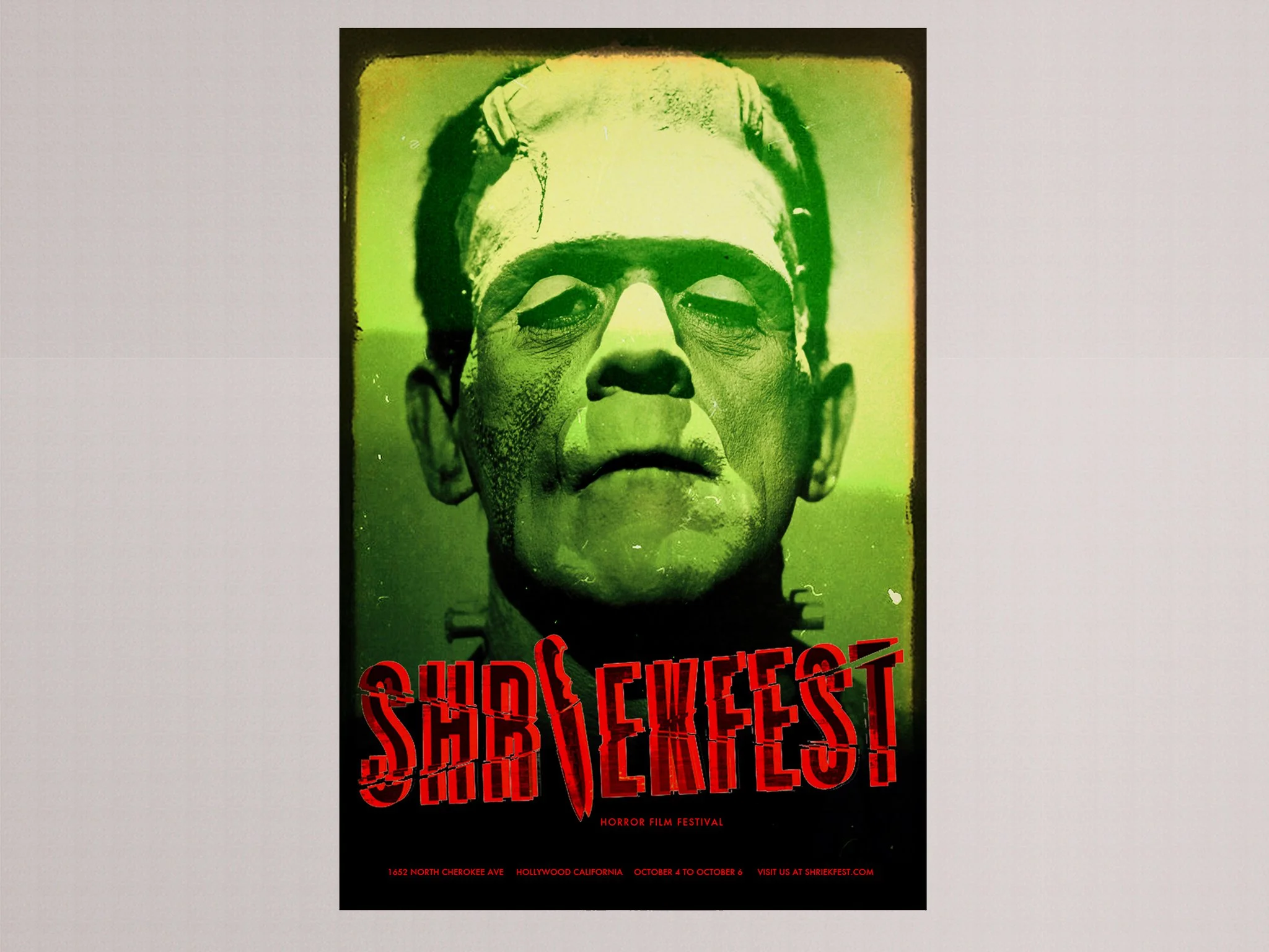
Shriekfest: Classic Monsters
ReBranding & Marketing Study - University Project
Shriekfest: Classic Monsters
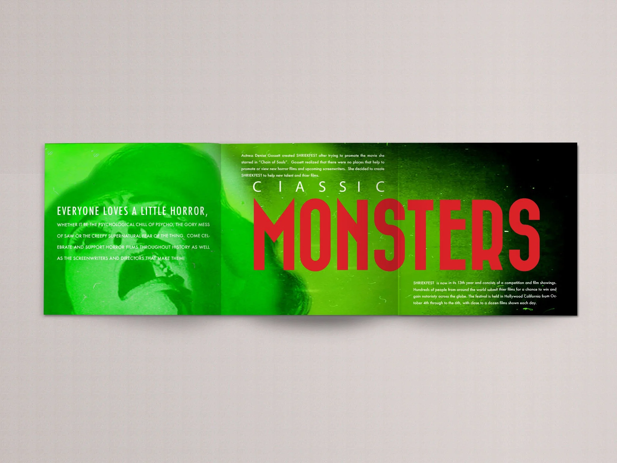
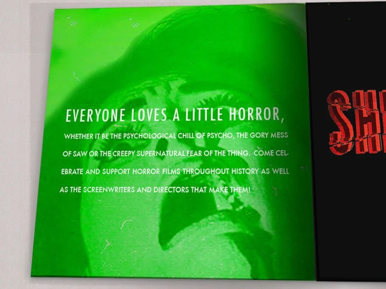
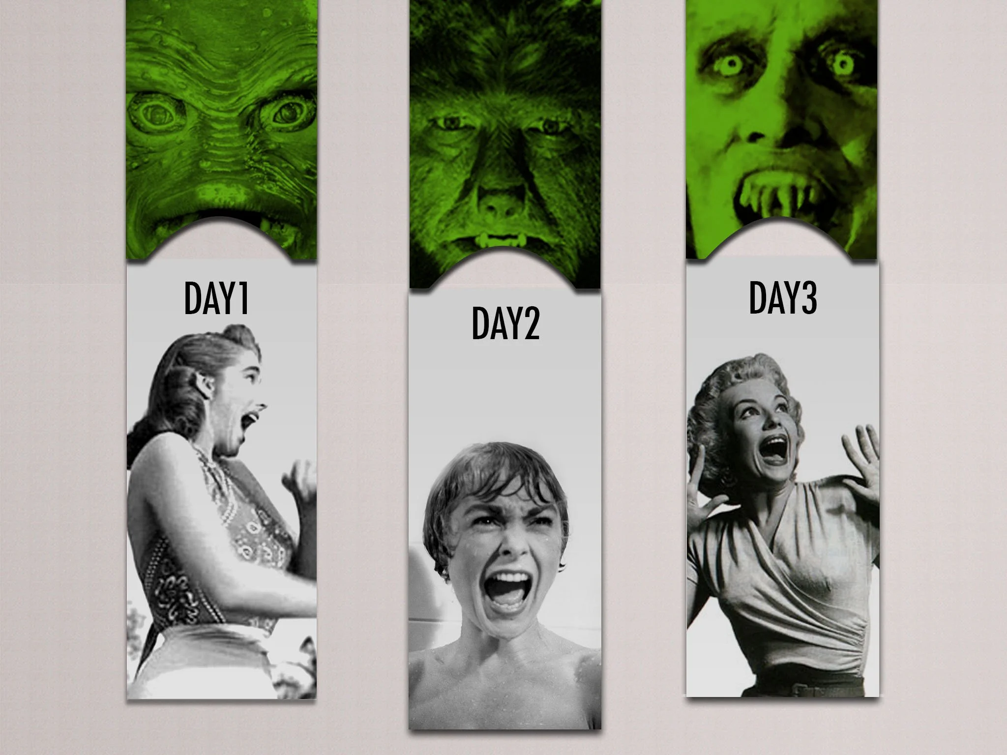
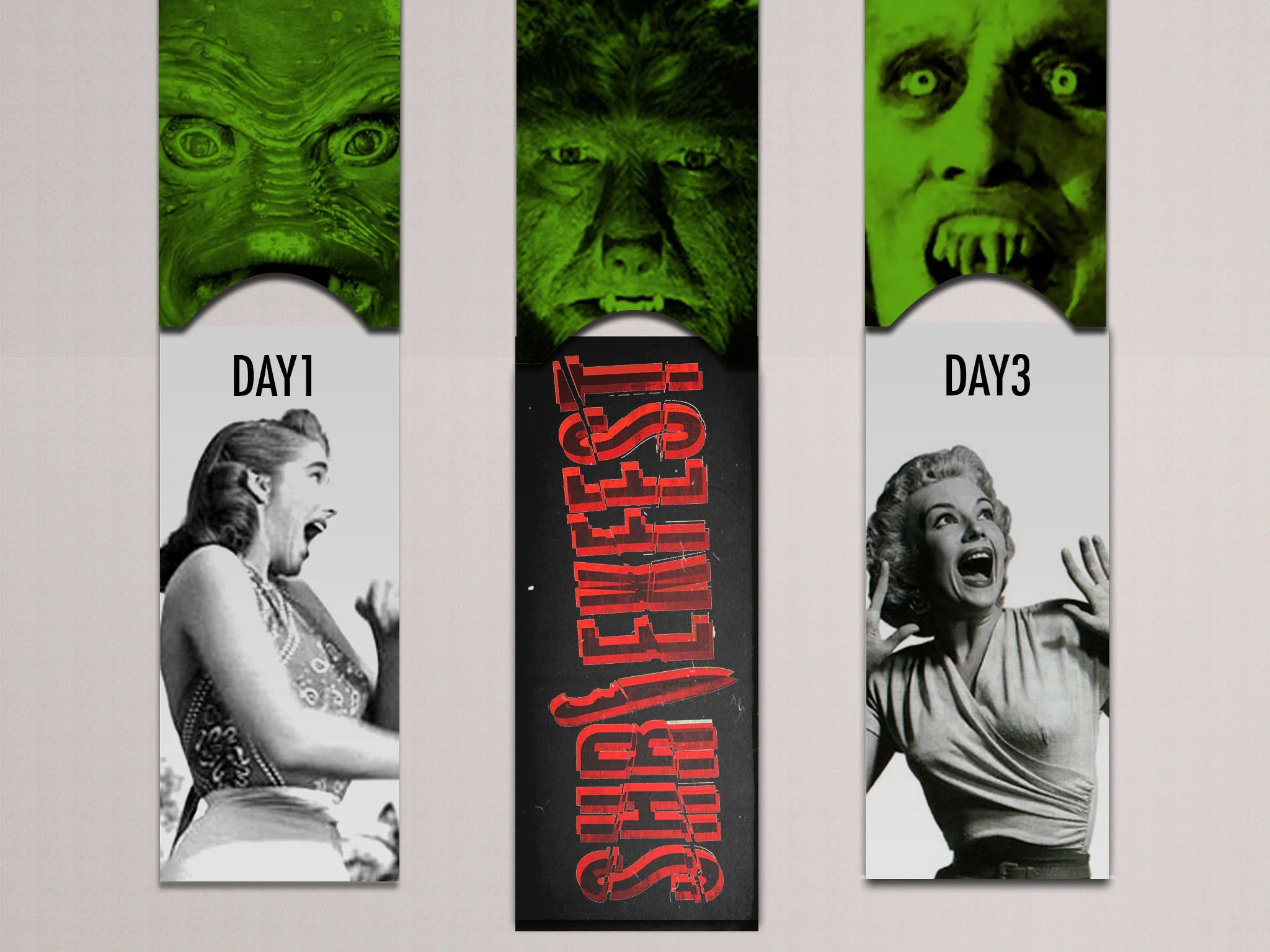
As a design student, I rebranded the film festival Shriekfest with a modern twist on classic horror. My project focused on iconic monsters, reimagining them with a contemporary aesthetic for today's audience. The promotional materials I designed included festival tickets, a dynamic poster, and a tri-fold booklet, all of which featured a consistent visual identity that was both nostalgic and fresh.
This is a student project and strictly a representation of my redesign. Rights to this brand do not belong to me.
-
My goal was to bridge the gap between vintage horror and contemporary appeal. By leaning into the rich history of classic monsters like Dracula, Frankenstein's monster, and the Wolf Man, I was able to tap into a sense of nostalgia that still resonates today. The challenge was to make these familiar figures feel fresh and exciting, not just a throwback. I accomplished this by using a bold, modern color palette and clean, dynamic typography. The overall design created a visual language that honored the past while confidently stepping into the present, aiming to attract a new generation of horror fans to Shriekfest.
-
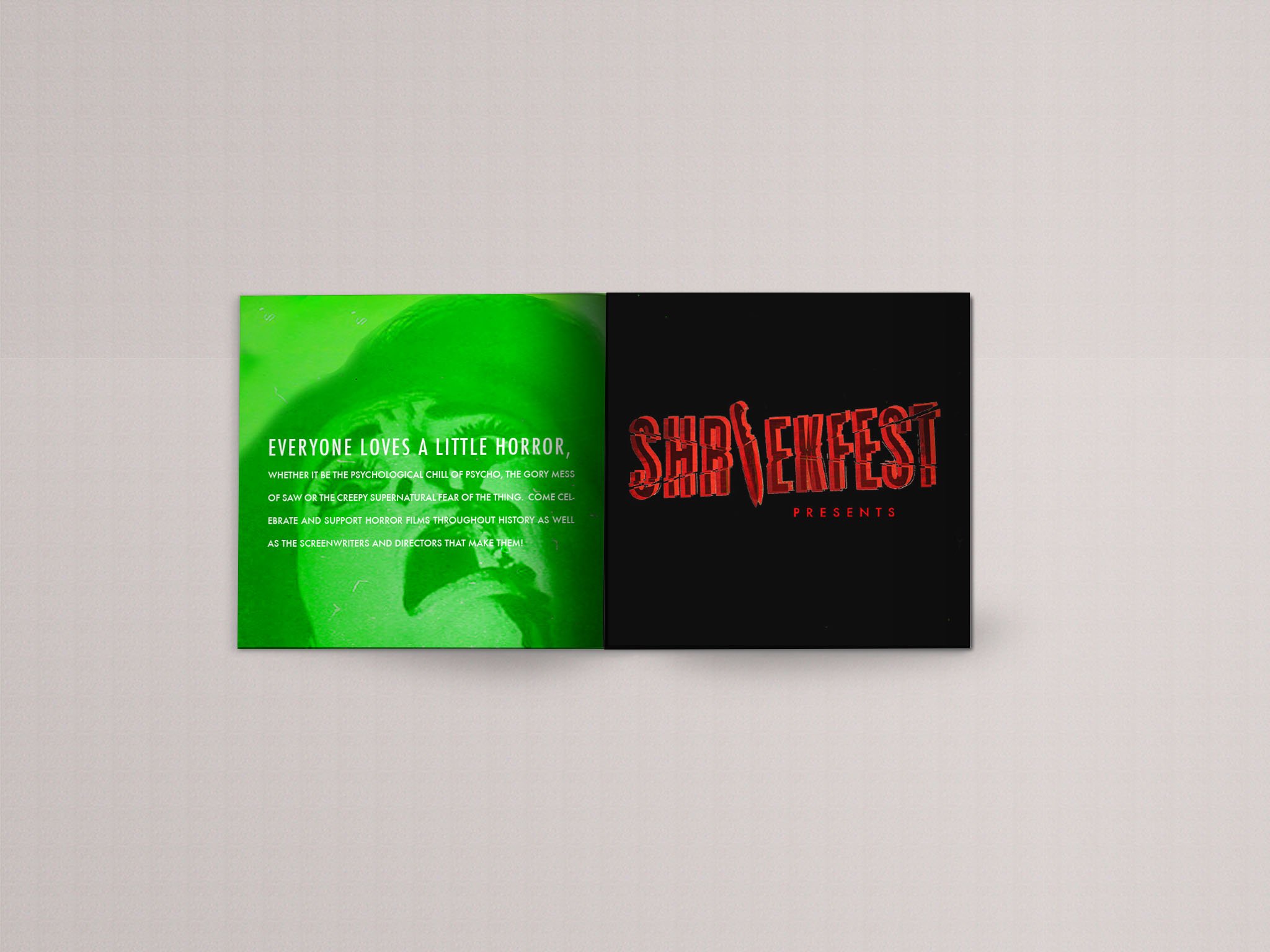
Beyond the visuals, I knew that copywriting was the key to making the project truly engaging. I crafted compelling taglines and descriptions that were both playful and chilling, reflecting the festival's unique blend of classic terror and modern energy.
In the booklet, the copy was designed to build anticipation, with film descriptions using evocative language to hint at the scares without giving anything away. This careful use of language was essential for creating an emotional connection with the audience, making them feel like they were part of an exclusive, thrilling experience rather than just attending a film festival.
-
To create a cohesive and impactful design, I conceptualized the project with the print process at the forefront of my mind. The poster, designed to be a centerpiece of the campaign, utilized a vibrant, limited color palette that would pop both on-screen and in print. I chose colors that were not only eye-catching but also easy to reproduce consistently across different mediums.
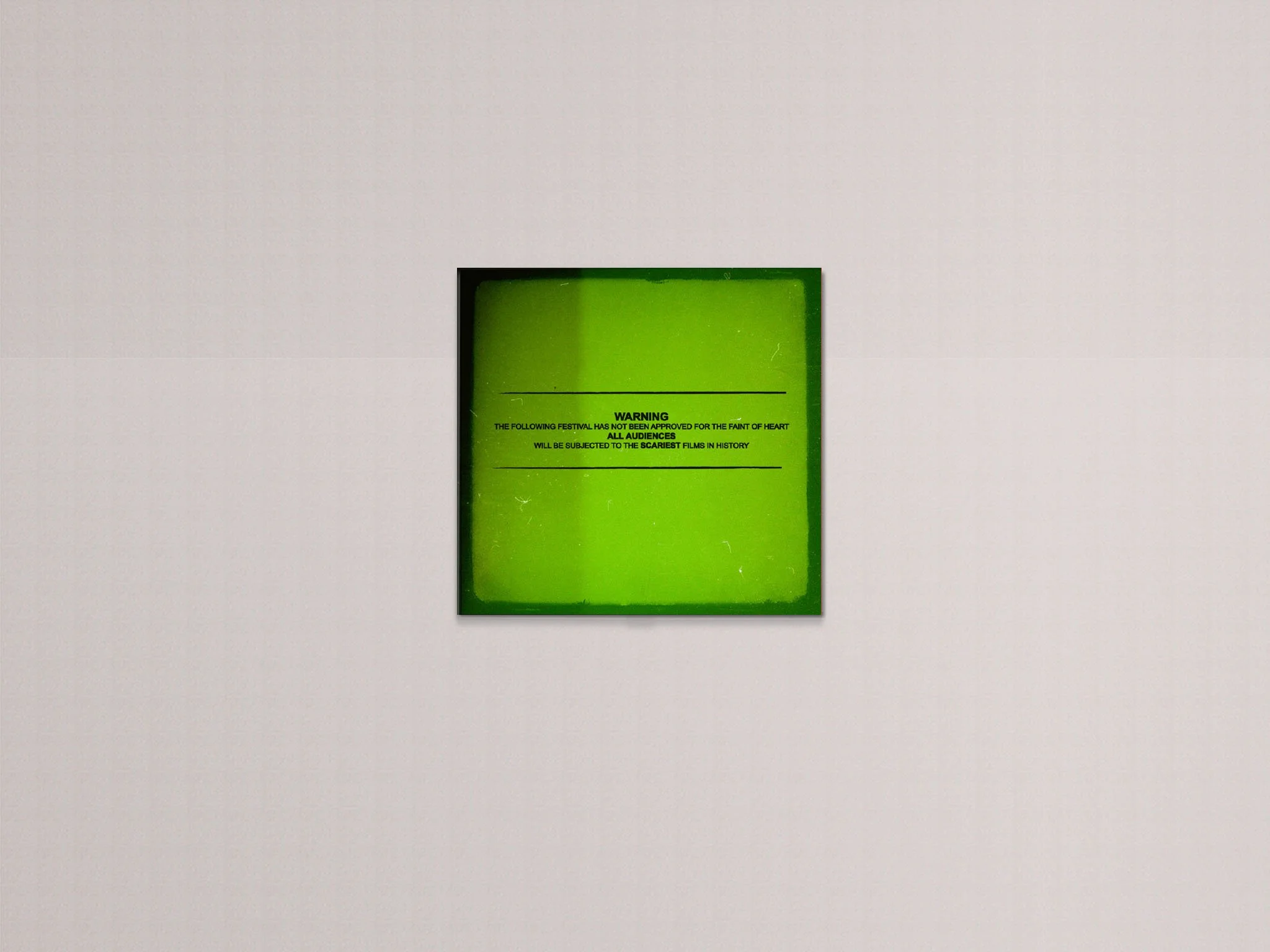
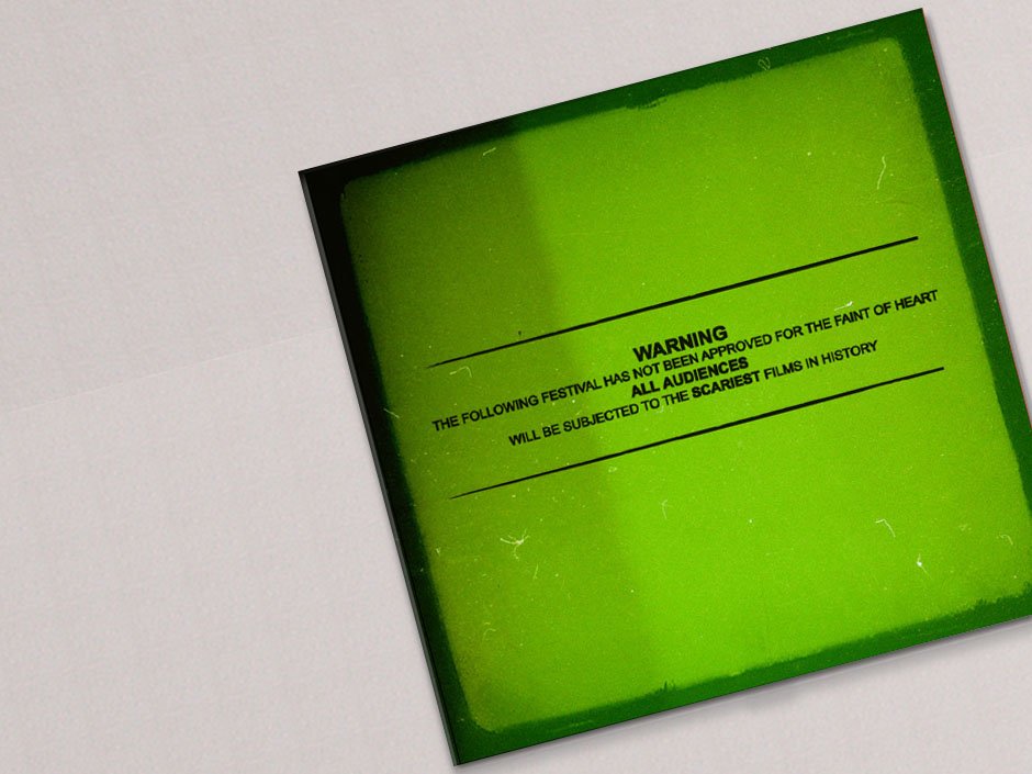
For the tri-fold booklet, I carefully considered the user experience from the moment they picked it up. The layout was designed to unfold in a logical sequence, with each panel revealing new information about the festival's schedule and featured films. I envisioned this as a tactile experience, where the quality of the paper stock and the crispness of the print would reinforce the modern, high-quality feel of the brand. Finally, the festival tickets were designed not just as a pass, but as a keepsake. The use of a durable card stock and a unique, die-cut shape would make them a memorable memento of the event, encouraging attendees to hold onto them long after the festival concluded.

Logo Redesign
This is a student project and strictly a representation of my redesign for the current brand. Rights to this brand do not belong to me.